Oh joy! It’s that time again when the Coachella Valley’s beautiful desert landscape is transformed into a hideous pile of ugly and distracting campaign signs as far as the eye can see. Sure everyone hates these signs, but campaign consultants say they work – and make a lot of money for designing and printing them – so candidates put them up everywhere. Hell, someone probably just stuck one in your living room while you were reading this. There is however one candidate who has found a way to cut down on costs for campaign signs: just reuse them from last time, even if you are running for a different post.
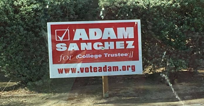
A Cactus Hugs reader sent in this sign – which someone with a well-trained eye can see, has a little cut and pasting action going on.
Those without the proper training might want to focus on the “College Trustee” stuck over the part where you can still see a “C” and “il” from “City Council.”
And who has time to match a size or a font while campaigning – especially for a position governing a college – just stick it on there and move on, dammit!
Also of note, I attempted to visit the website on the sign, but nope. Nothing there.

Everyone knows campaign signs are like car registration stickers. You just keep sticking the new ones over the old ones – and, when it gets out of hand, it’s time to buy a new car.


